
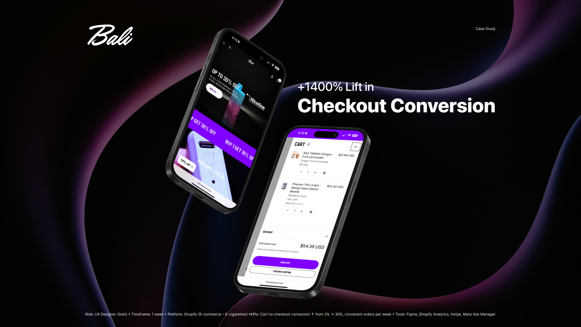
UX Case Study: 2%→30% Checkout Conversion
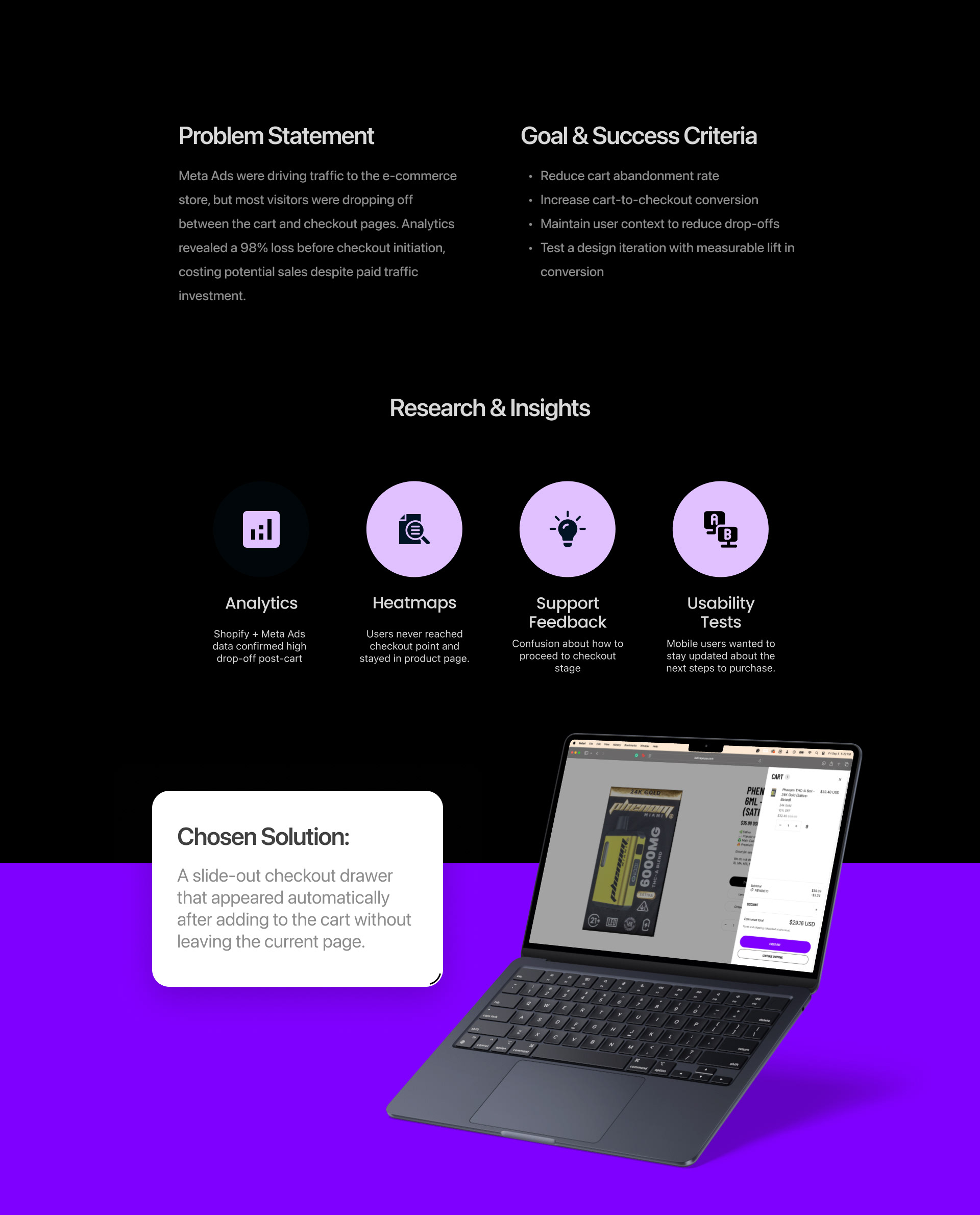
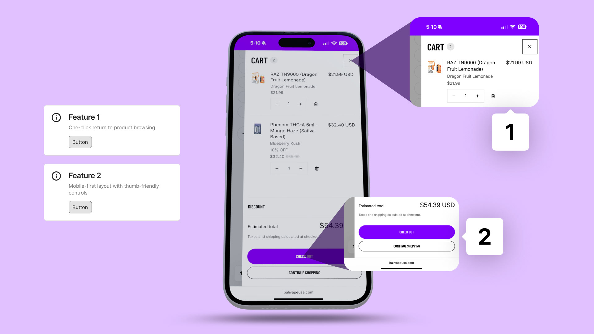
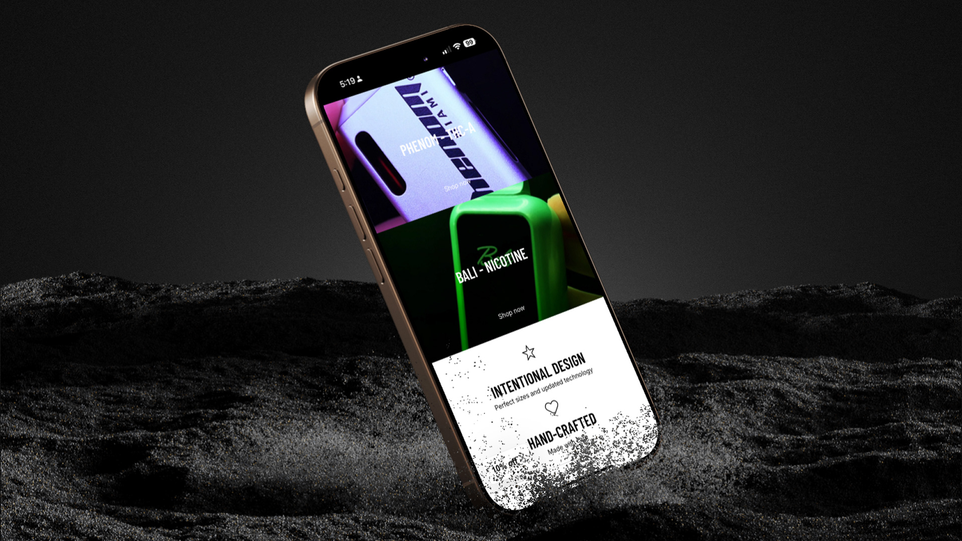
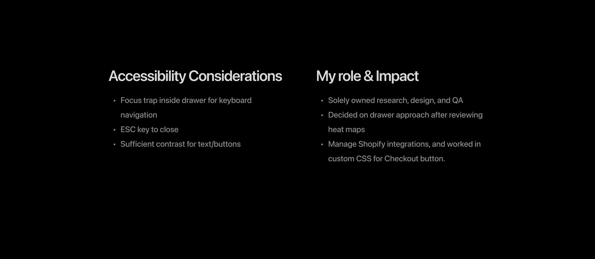
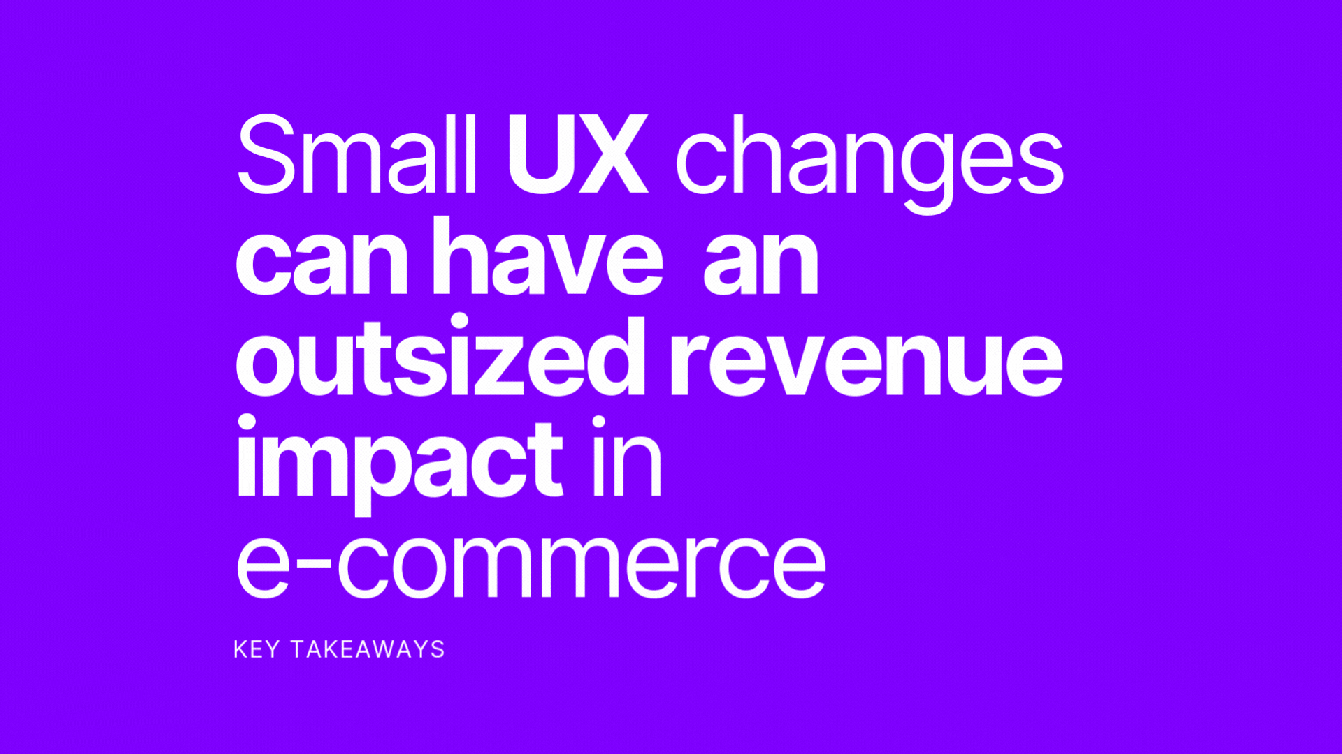
This UX case study showcases how I redesigned the checkout experience for an e-commerce store on Shopify, boosting cart-to-checkout conversion from 2% to 30% in just one week. Through data analysis, heatmaps, and quick usability testing, I identified that users were abandoning the cart before checkout due to loss of context and uncertainty about how to proceed. The solution was a smart checkout drawer that allowed customers to review order summary, and easily continue with checkout flow without leaving the cart page. This reduced friction, increased trust, and streamlined the user flow—especially on mobile, where 80% of traffic came from. The result was a +1400% lift in conversion rate, moving from almost no weekly orders to consistent sales, even after campaigns ended. This project demonstrates how a simple, user-centered design change can have a significant business impact in e-commerce.
You may also like

Childbook Illustration - Mock up
2022
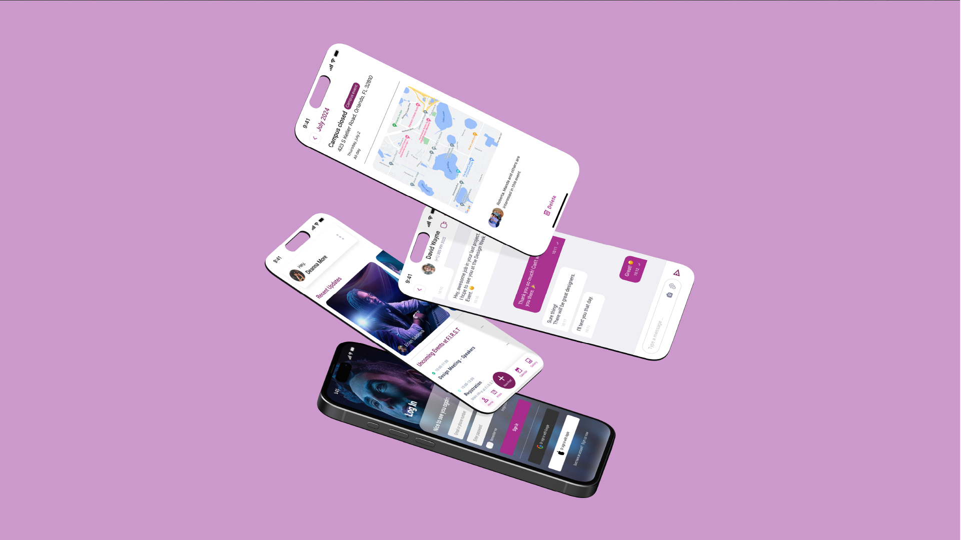
App Design - F.I.R.S.T. Institute
2025
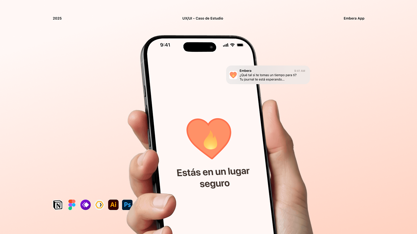
Embera – App emocional | UX/UI Case Study
2025

Packaging Design - Bali Legend
2024
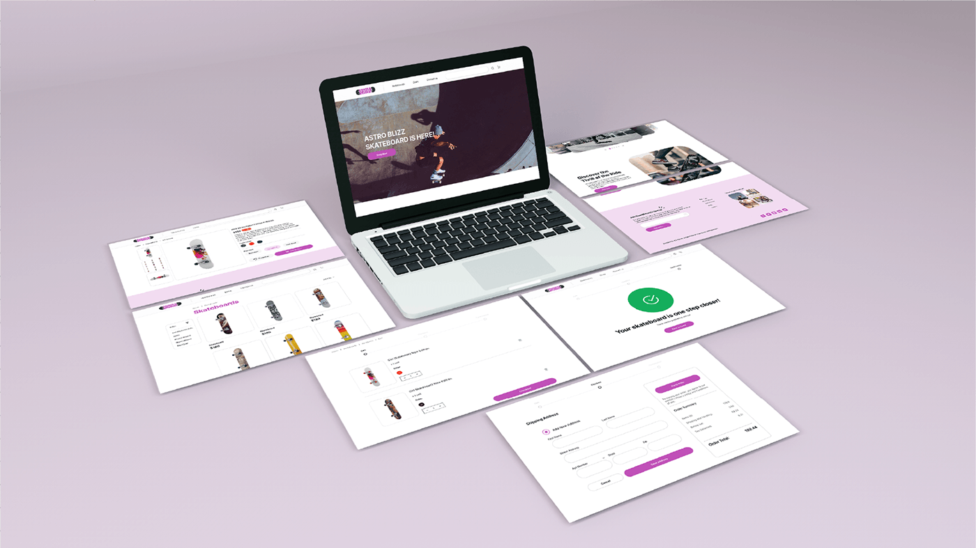
E-commerce Design - UX/UI Project
2025

Landing Page - Skincare Company
2025

Visual Identity - Alaisha
2024

Creative Portrait | Photo Editing
2024

Branding - Psychologist
2022
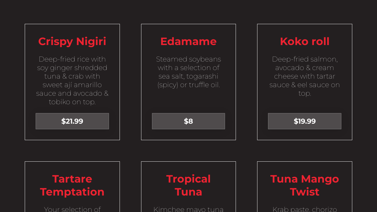
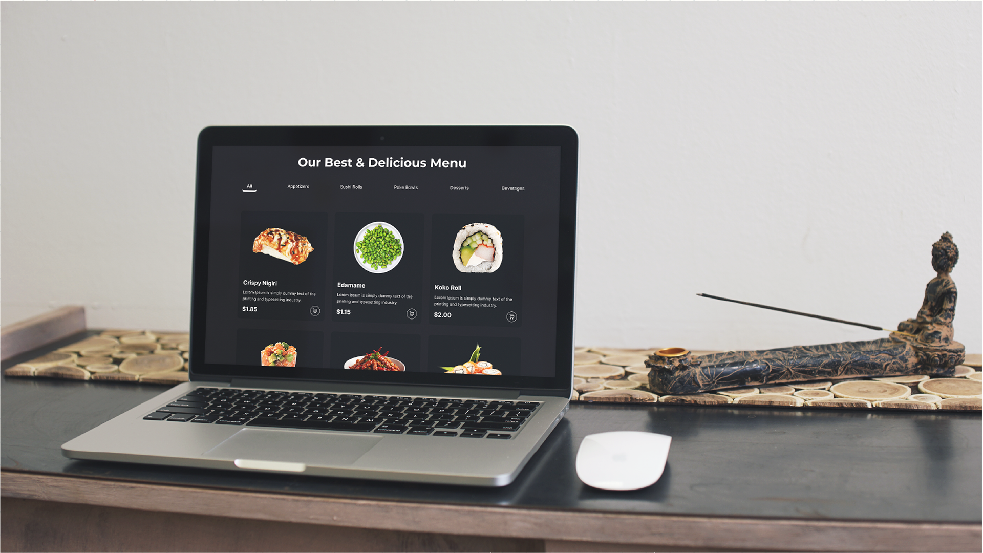
Re-design Menu Page - UX/UI Project
2025